New icon set for SkillShare
SkillShare annonced a workshop aimed at making the new icon set for the SkillShare platform. The set consists of 10 icons, and is going to be used both in print and screen designs for the platform.

Contest entry

Illustration

Icon set
The Competition
Competition started with two SkillShare classes focused on icon design, and then it was up to each participant to make a proposal. The community was commenting and questioning designs and design decisions, and the work was then judged by a SkillShare team, who chose the winning design.
Design constraints were given in form of colors and stroke styles, and focus was put on pixel perfection, as the icons were to be widely used in print, but also in screen interfaces.
Icon set
The icons were to depict 10 different actions - and I started by thinking about each of those action: what do they really mean, what do we (users) associate with the specific actions trained by years of internet browsing, and how do specific actions differ one from another, in what way are they actually different and what could nudge out attention to the correct one if we are looking at them side by side.
The take away
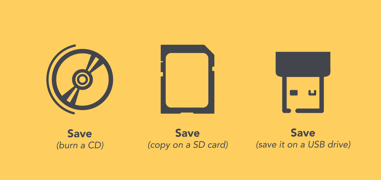
What I’ve enjoyed most during the contest, was working on the “save” icon. I wanted to do a little twist on the traditional floppy disc icon, and looked for another medium for storing data - one that is starting to be retro nowadays is a CD, and though it would be interesting to see if this one takes on. Then some other participants pointed out that CD could rather be interpreted as sound or music than as burning CDs with data, a.k.a. saving. This is why the final design uses USB as a depiction of the save action.
Find more on workshop, designs progress and community comments.