Credit card payment terminal UI
Redesign
eThor is an app that goes onto a credit card payment terminals. The competition was about is the UI that waiters and consumers use in a restaurant when paying bill.
The design brief called for two themes - a dark and a light one. The contest revolved around two screens - first one with all current orders, and the second showing order detail for the particular order chosen on the first screen.

Awareded design

Contest entry

Illustration
Charcoal gray
The design brief called for a charcoal gray as the basis color for the dark theme. This is why I started this contest by making a color palette - testing which colors would complement and accent charcoal gray, while still adhering to Material Design. This is the first color palette.
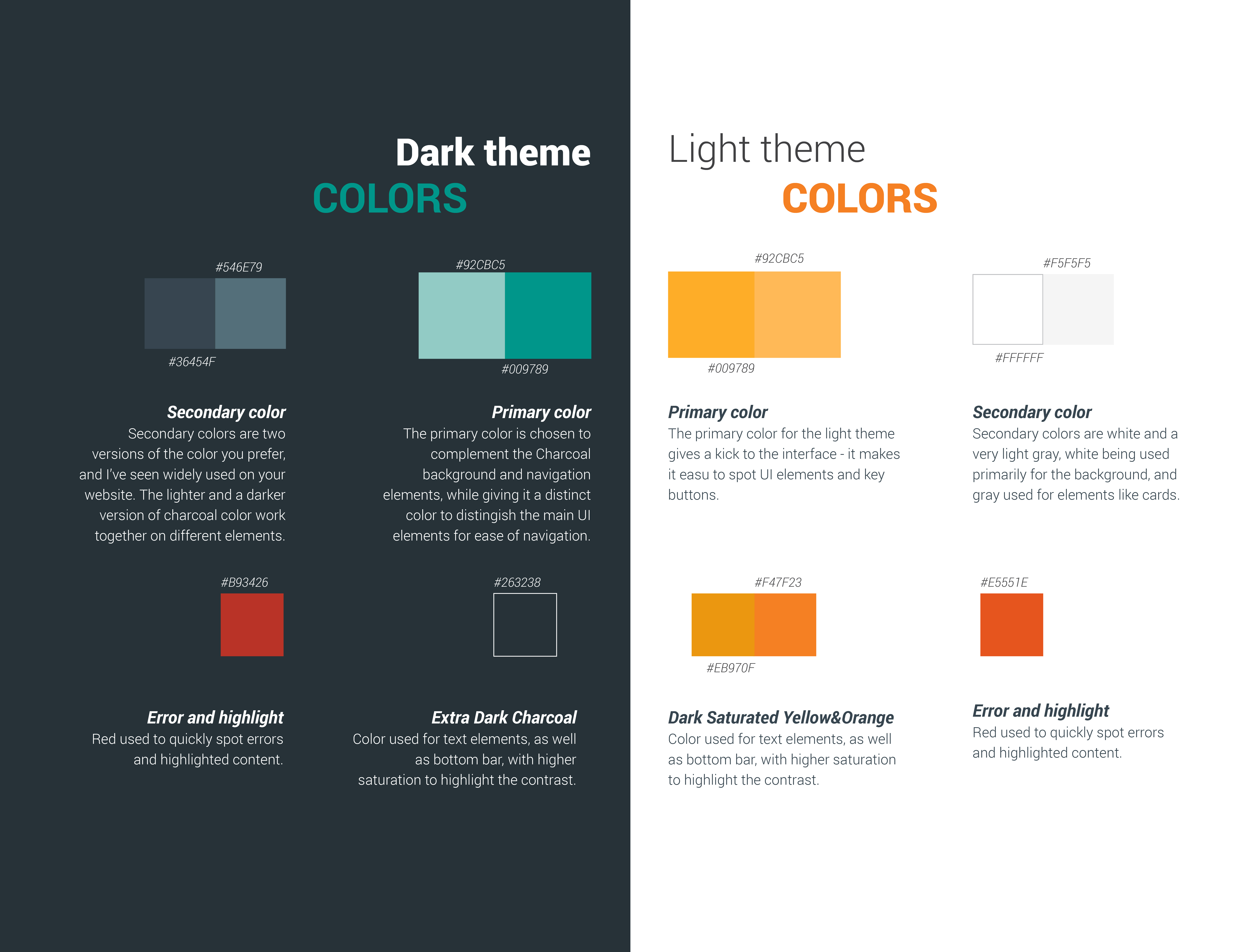
The second color palette I made was much calmer, with less saturated color accents, that gave a different look to the app.
Two contest entries
With two color palettes at hand, which I both thought could work depending on what the contest owner would like better, I enetered two designs to the contest. All the illustrations below show both dark and light theme, with to different color paletters.
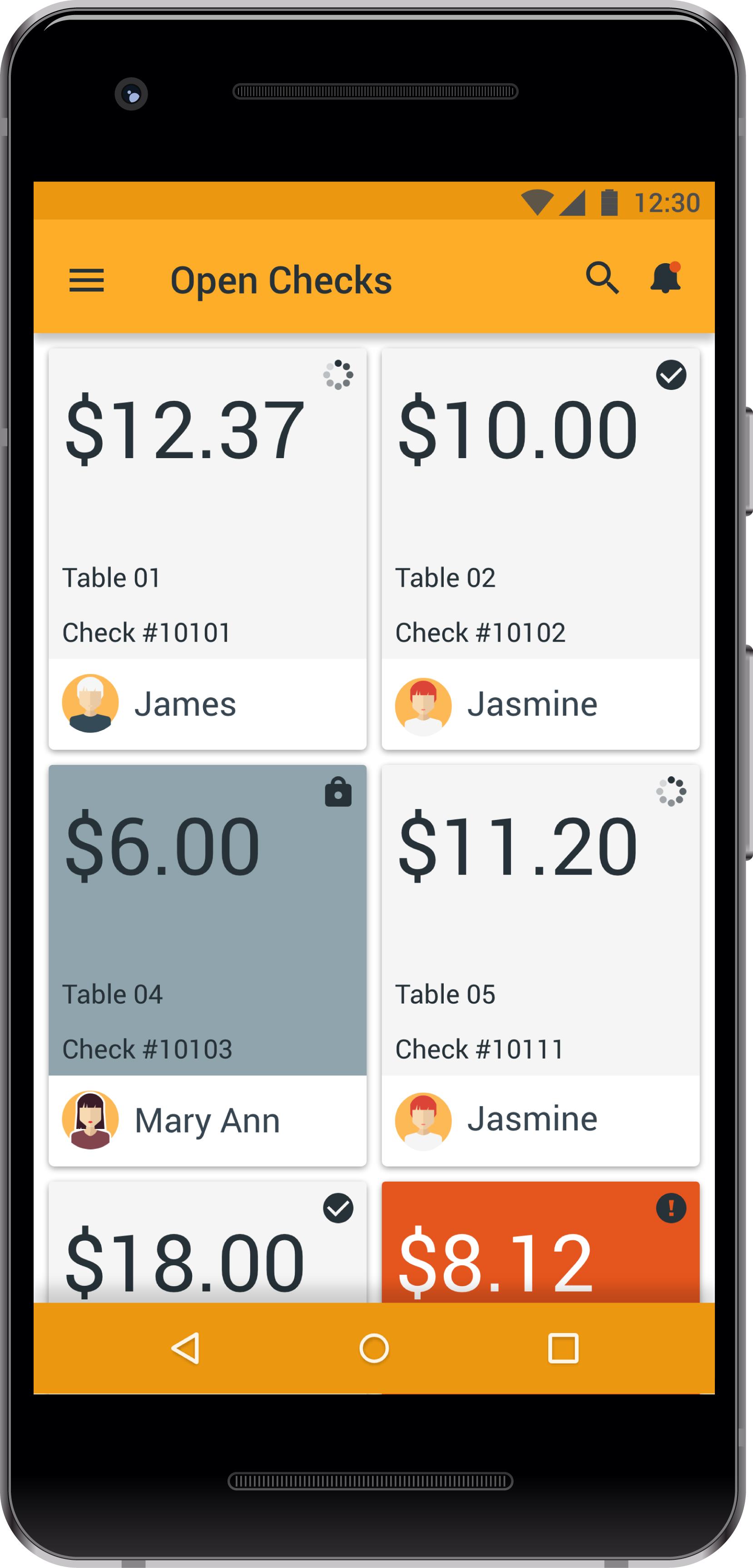
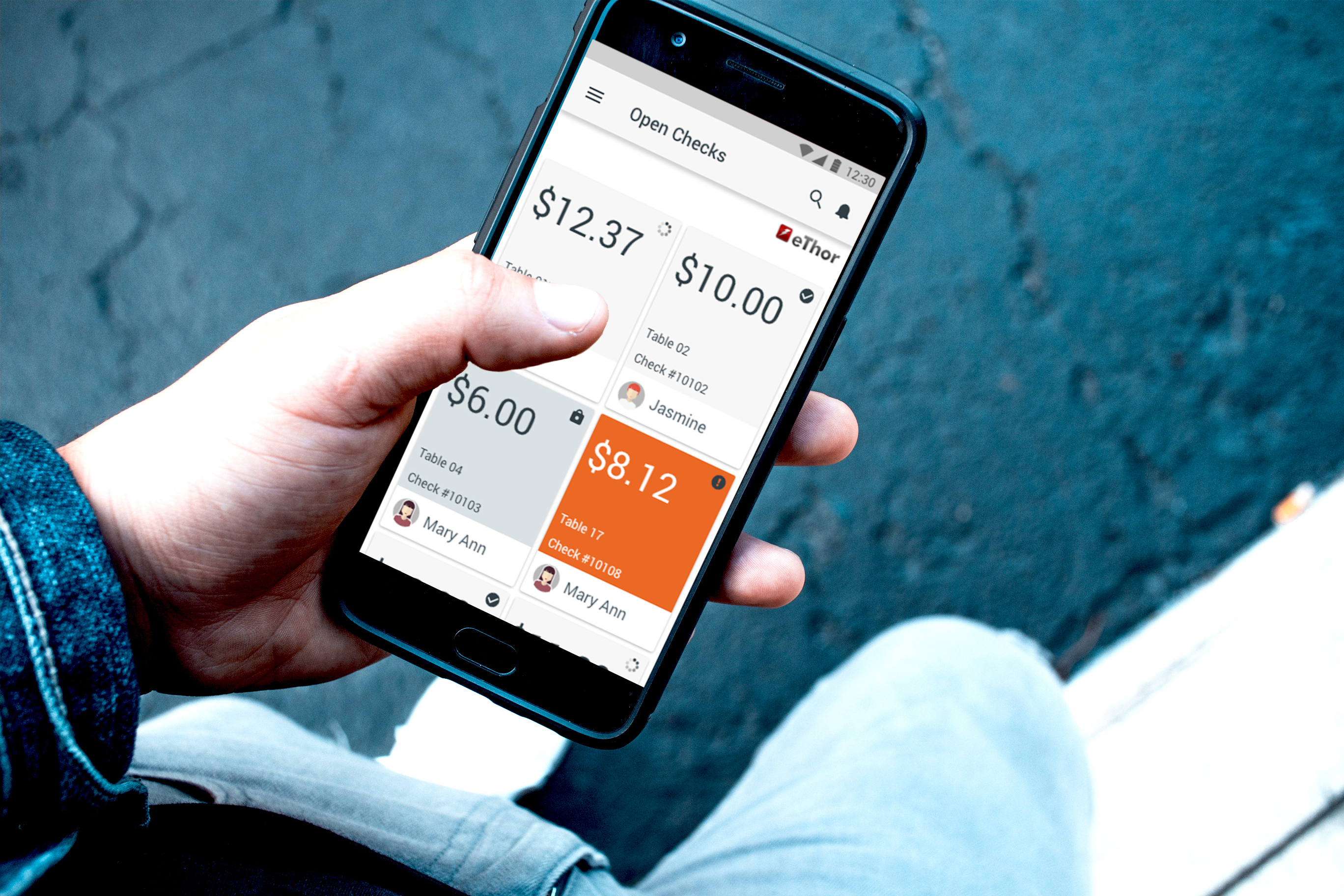
Open order list screen
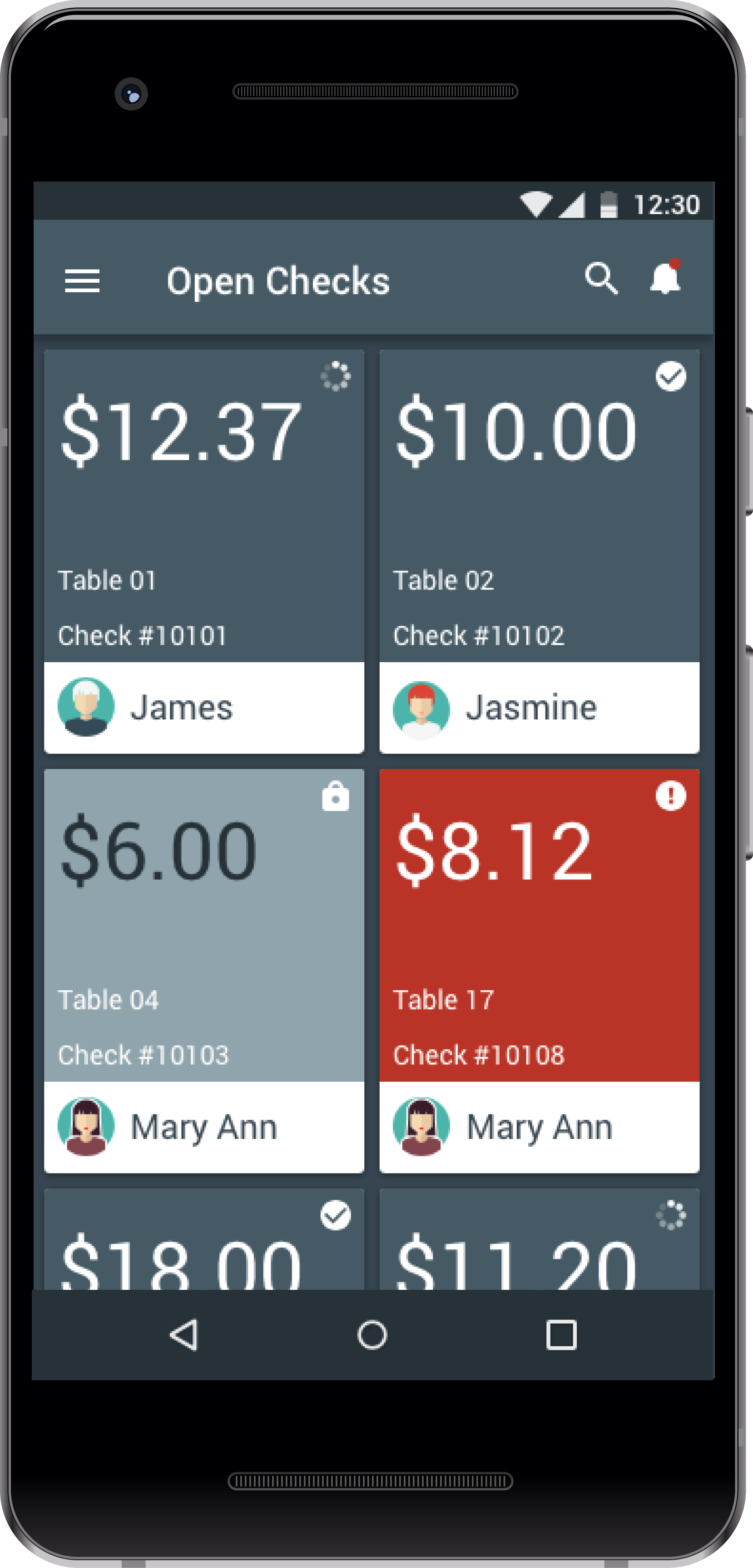
Dark Theme 1
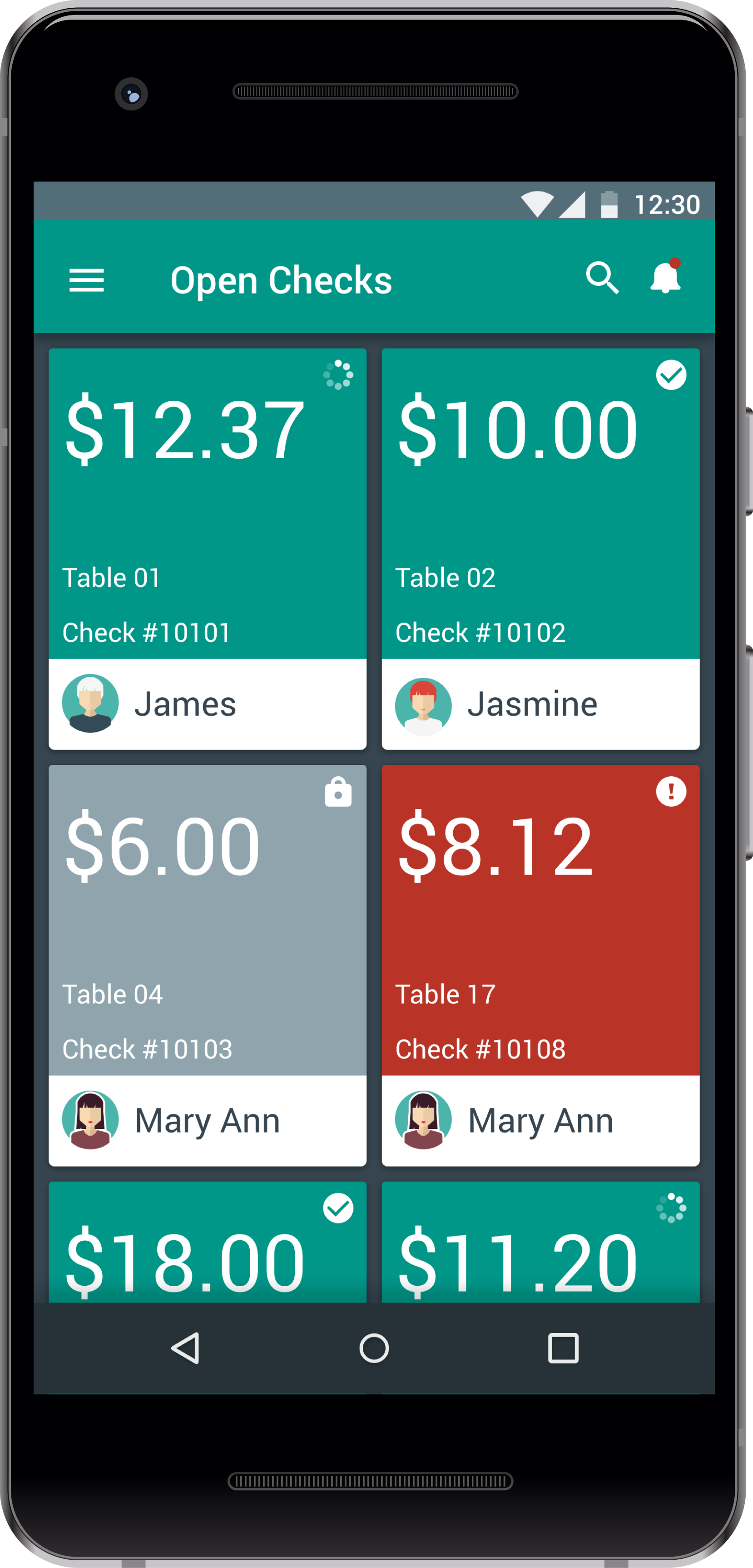
Dark Theme 2
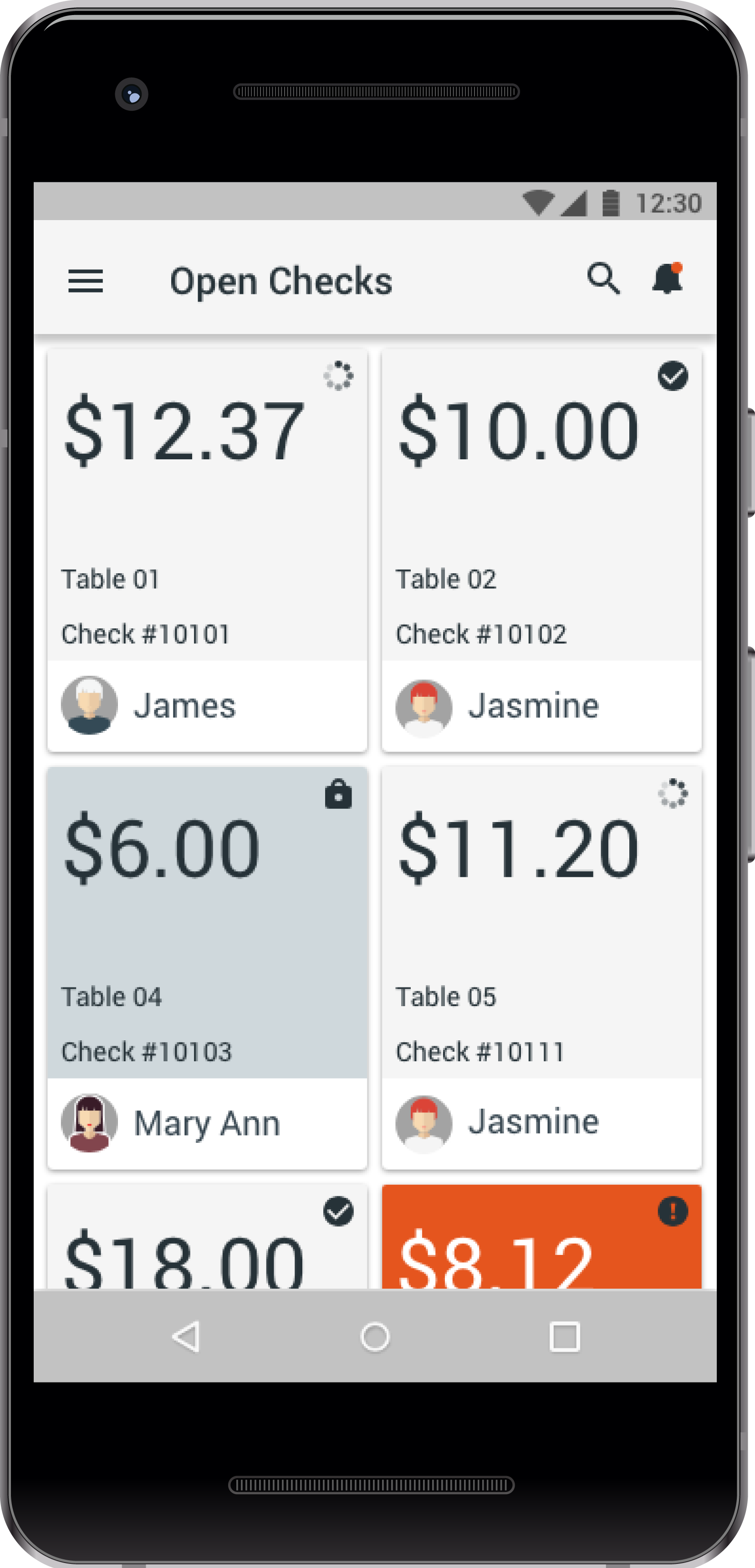
Light Theme 1
Light Theme 2
The separate orders are organised as cards, that user scrolls through.
Cards are organised so that the amount due is the highest level of information - the amount is displayed at the top level of the card. The second level of importance is the employee responsible for the transaction, and for ease of skimming each employee has his/her own avatar. Avatar could be either more generic or customizable, it allows one to quickly spot who is in charge for the table/receipt in question.
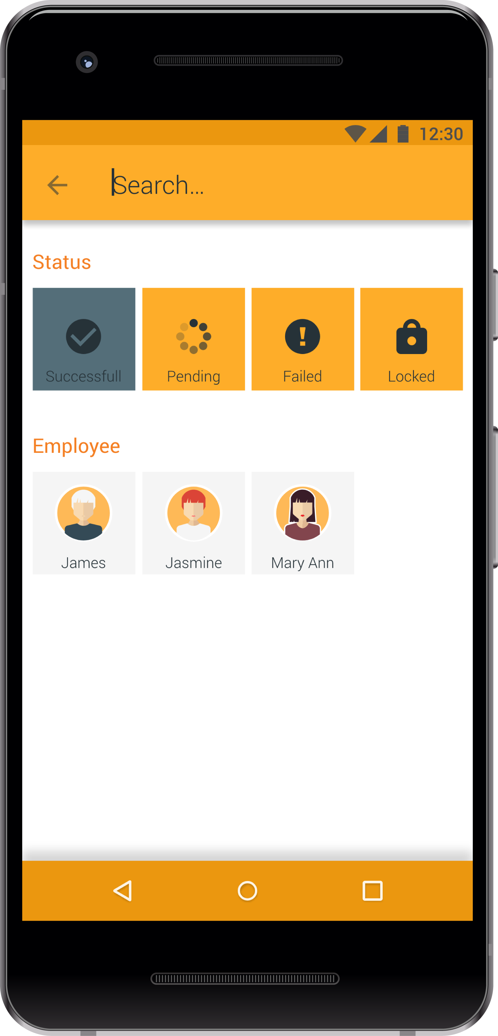
Colors are used to highlight the account that needs attention - a failed transaction is quickly spotted by the color(red). The accounts are in addition coded with an exclamation mark icon in the top right corner of the card.
A locked account is colored gray and has a padlock icon in the corner, while pending and successful transactions have the “regular” color, indicating that everything is OK. Card ordering depends on the screen size, with two column layout on the mobile phone size.
Search orders
As material design is the framework the app is based on, and Google is the leader when it comes to search(es), I decided to implement the best practice in the industry - when magnifying glass icon is taped, the search field opens to the left. User can either search by keyword, or chose to filter by status, employee, or other filters can be designed. The fur screens shown are two iterations of the theme and color palette - light and dark theme with more vivid and calmer colors.
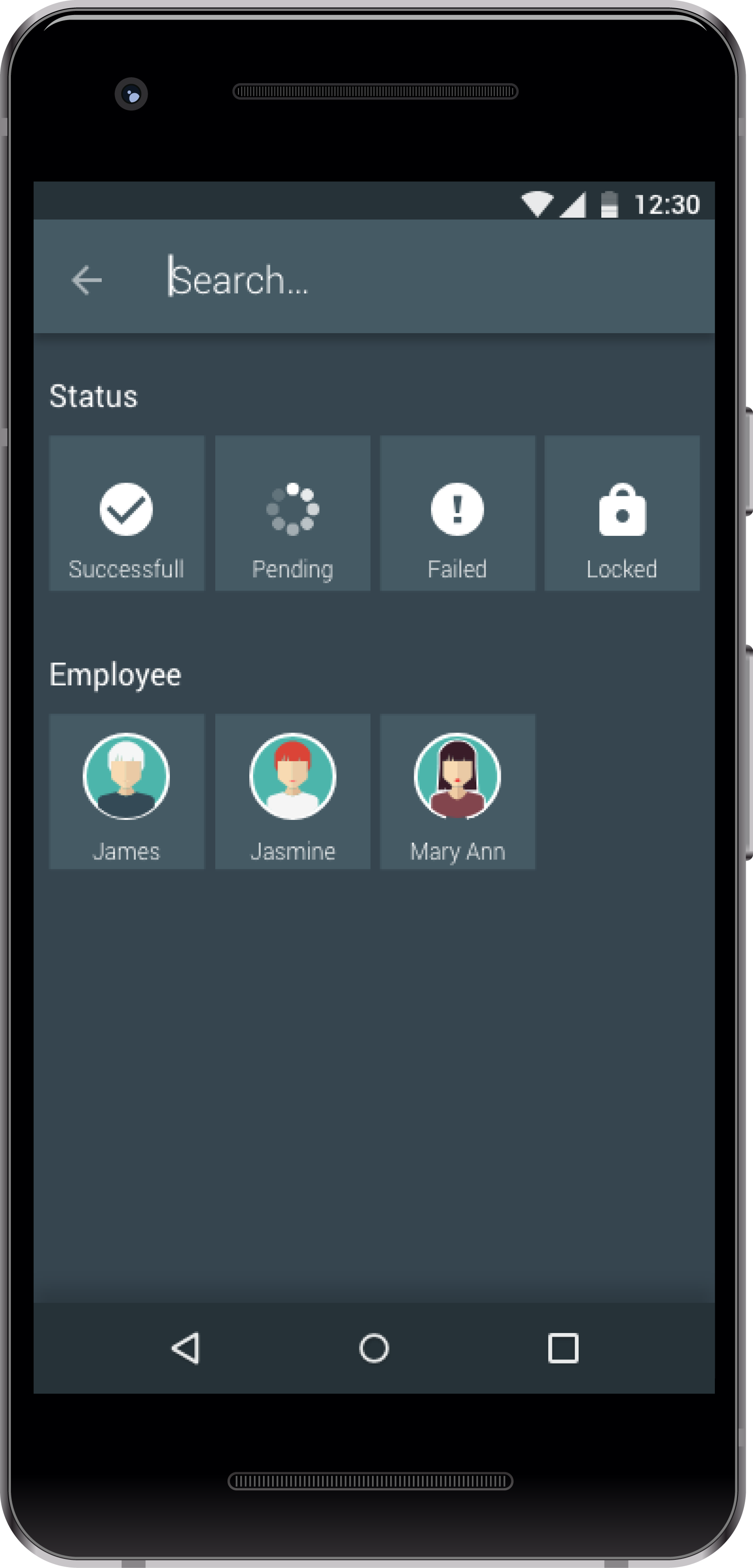
Dark Theme 1
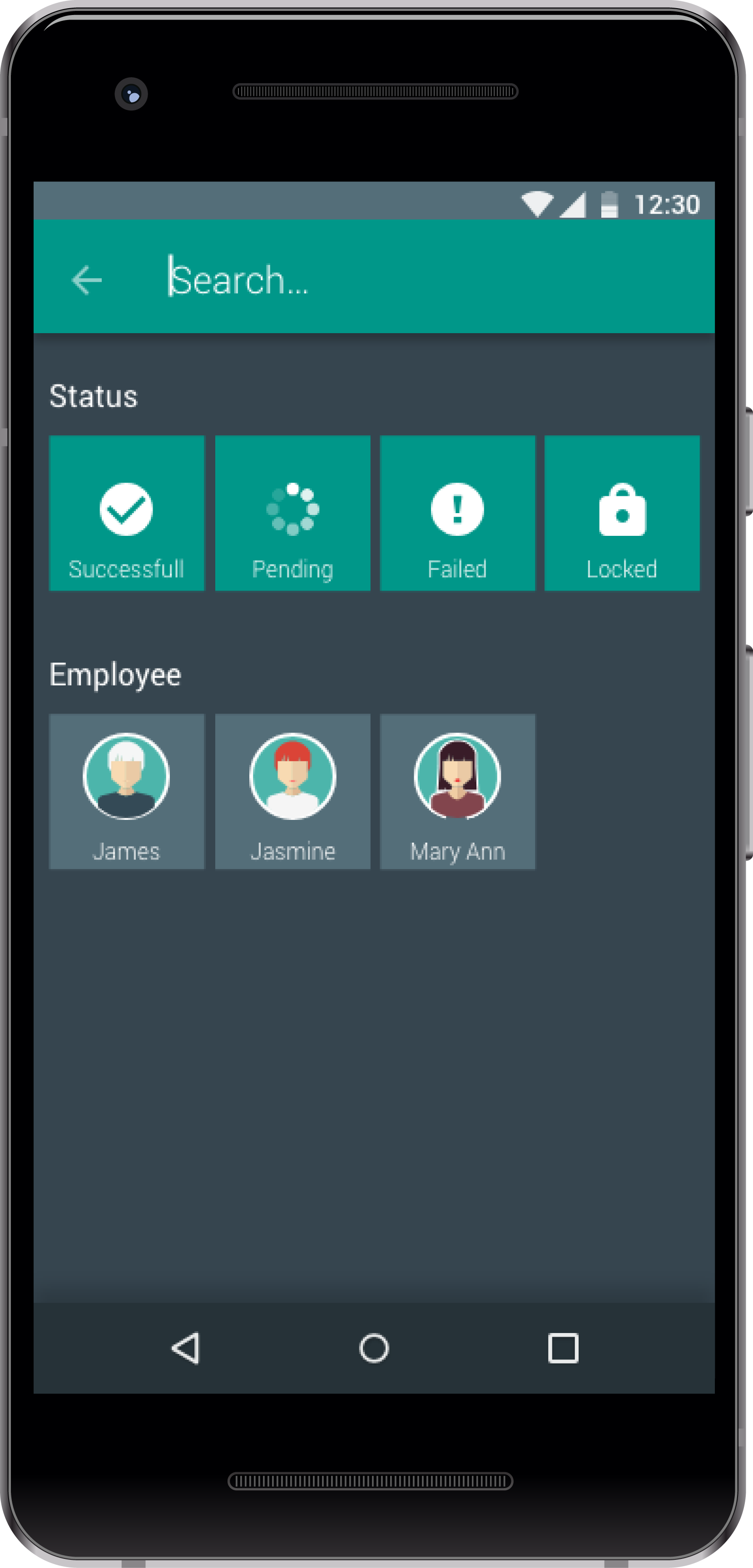
Dark Theme 2
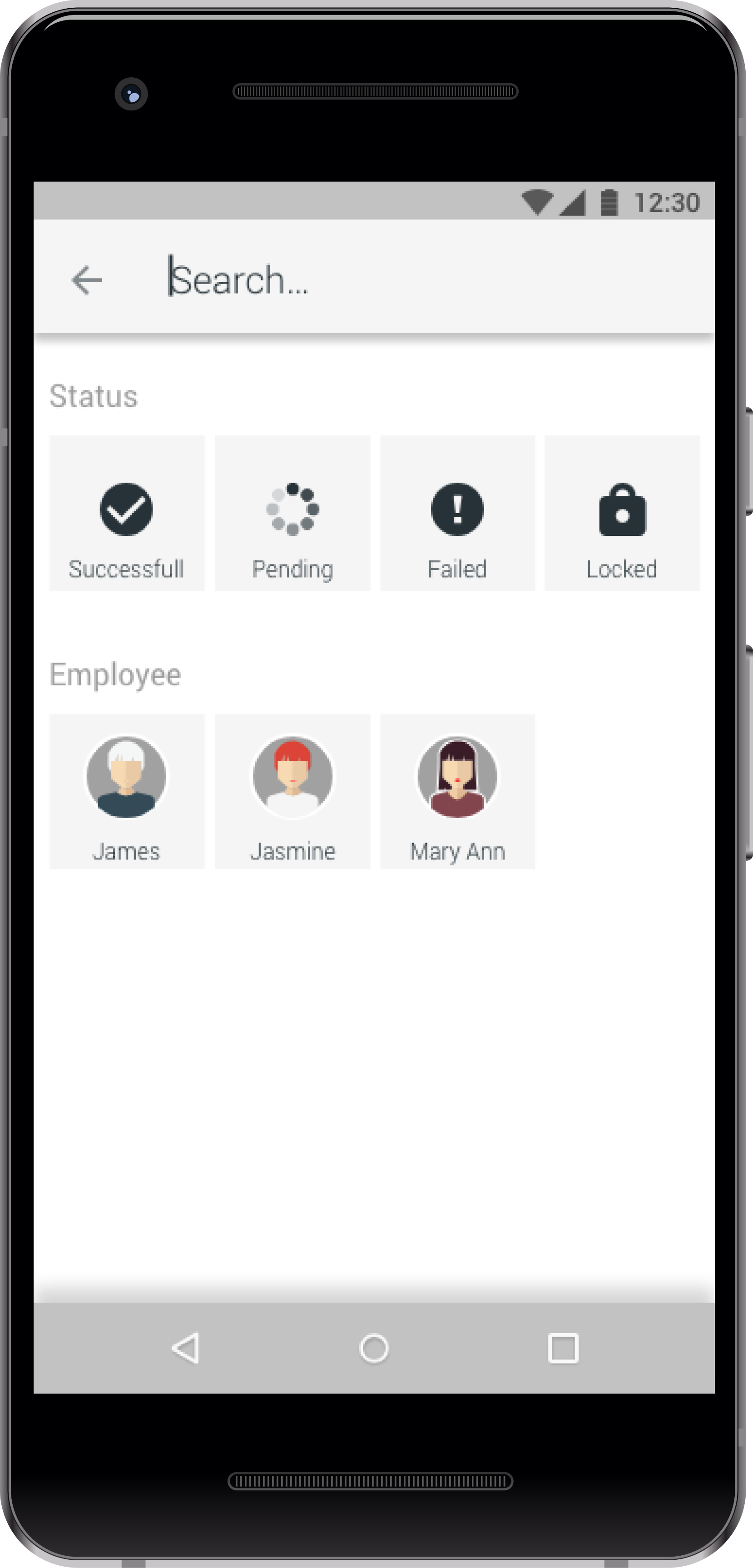
Light Theme 1
Light Theme 2
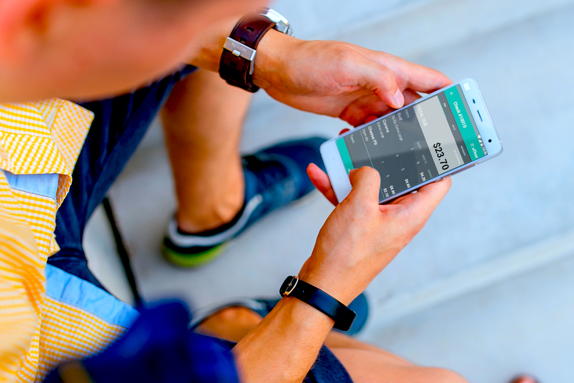
Order detail screens
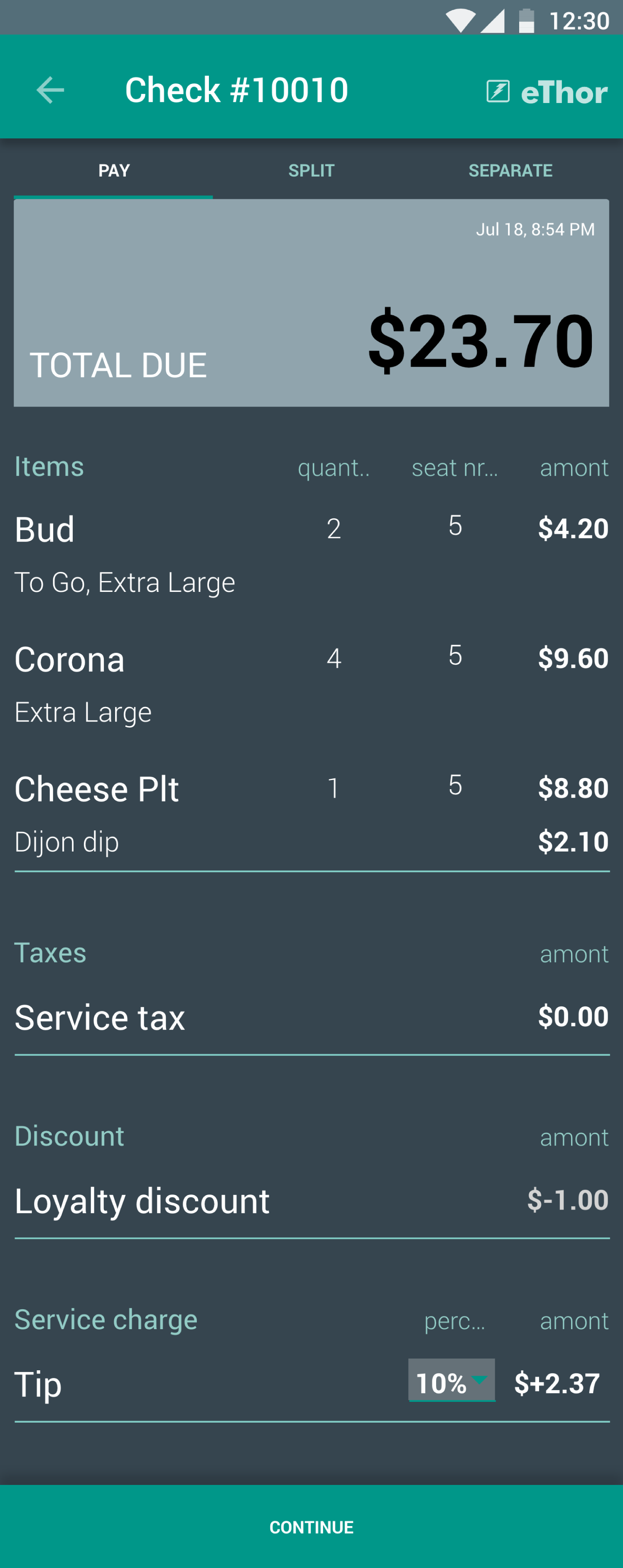
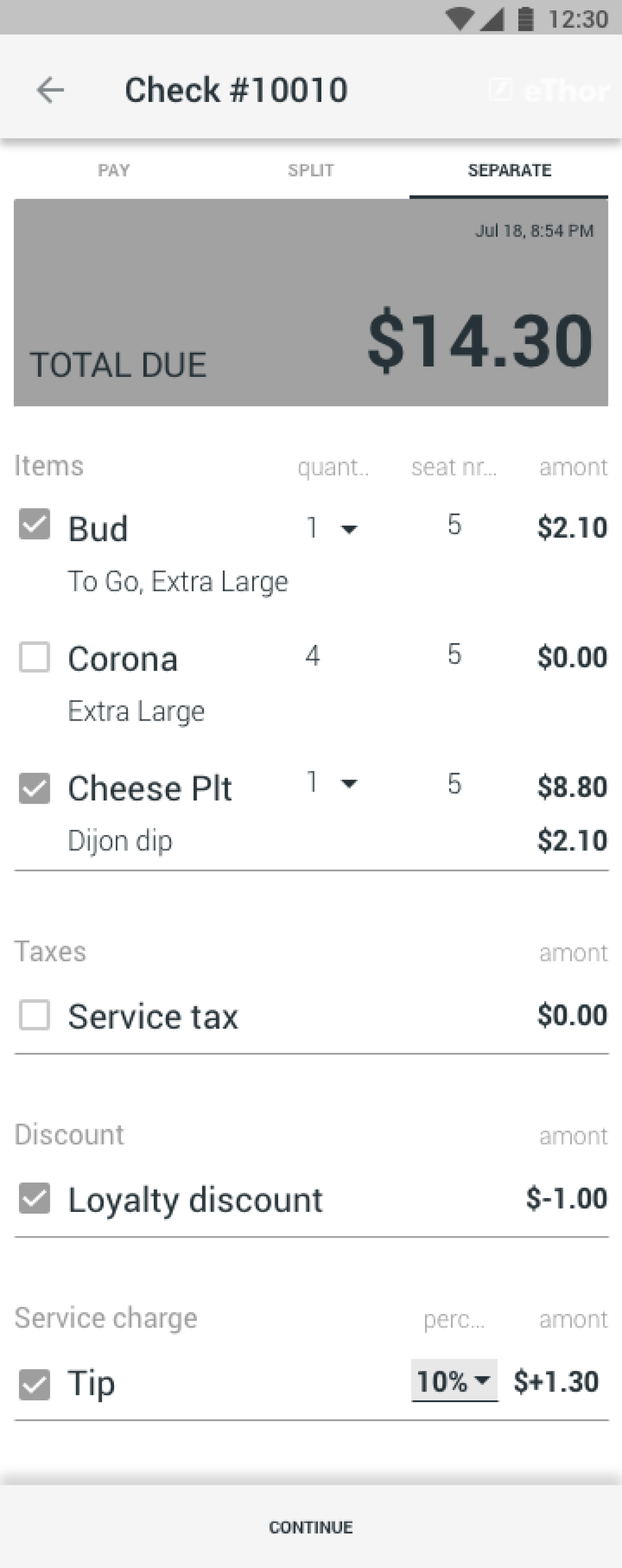
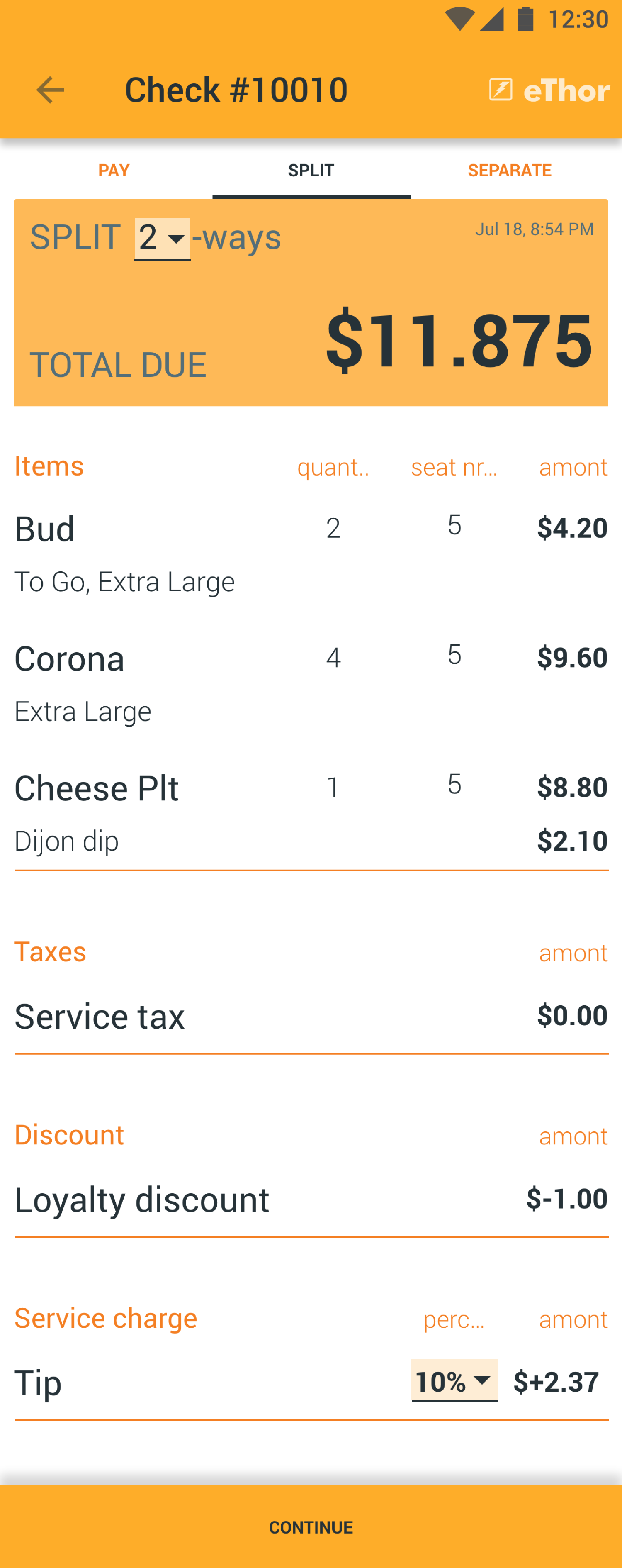
The page title shows check number, but the title could be any number of different things, it could also be usefull to have table number as the main title, if the restaurant has numbered tables that are visible to guests too.
The tabs below the top bar give the user option to select how the bill is to be payed - whether customer pays for the entire bill, splits it in equal parts, or each customer pays for their own food & drink. Any of these options can be the default, depending on what the restaurant/bar experiences as the most commonly needed option.
The top card shows the total calculated amount to be payed. This amount is further broken into an overview over the order, tax, discount and service charges - with order items organised in a table, for ease of skimming. On the bottom of the screen is the main action button, that allows the user to continue to the payment options.
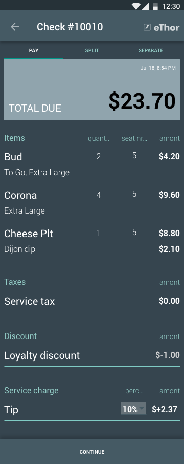
Pay the entire bill
The only option customisable for the user is the top percentage.
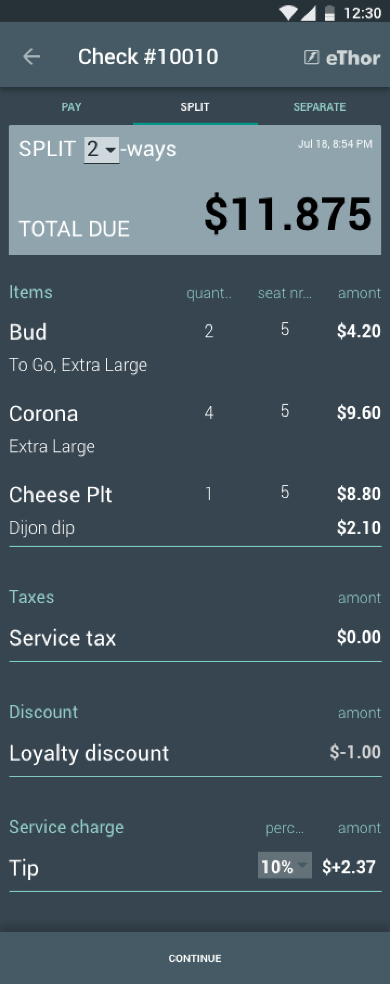
Split your bill to equal amounts
If the customers want to split the bill, the waitor can choose this tab, and choose how many people to split the bil to.
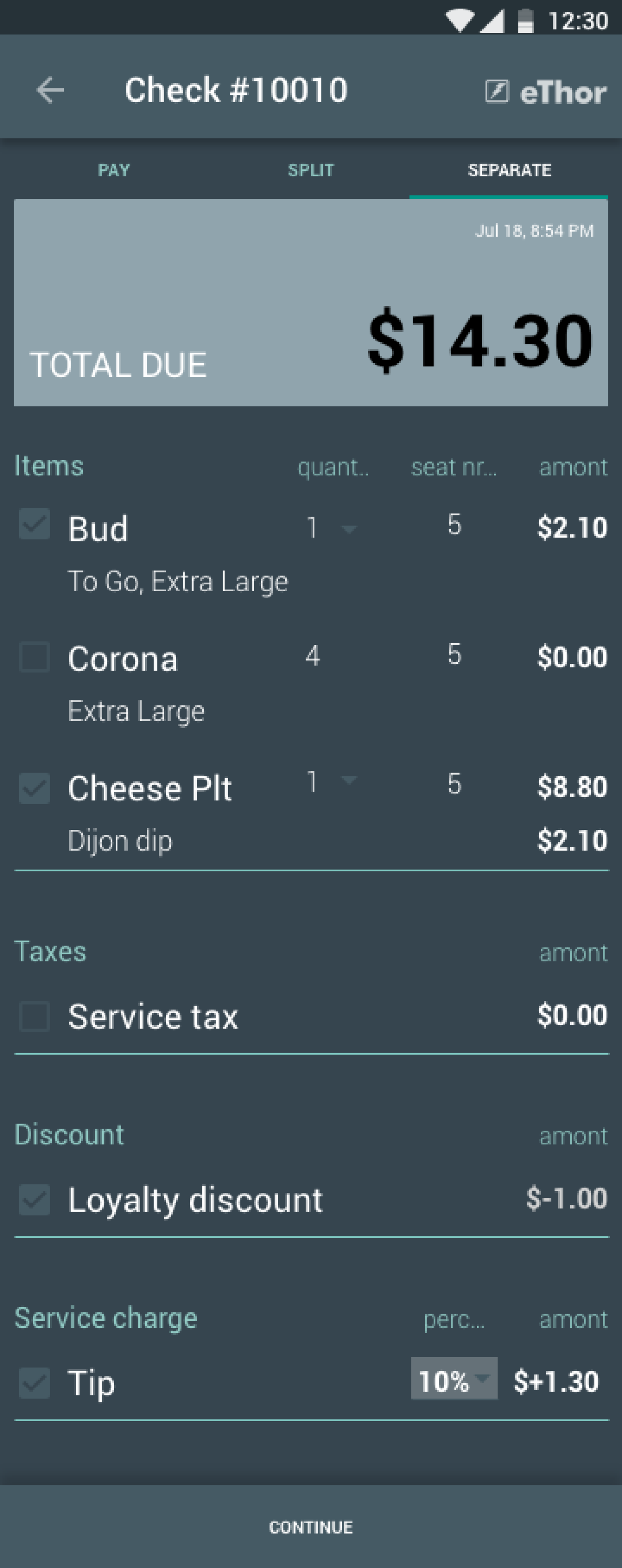
Pay separate
Sometimes customers want to pay only for what they themselves have consumed, and this mode allowes for the waitor to choose the items the customer is paying for - both check-box for the item, and the quantity of the same item.
Order detail screen in different themes and color palettes
The result
The design was not the winning design, but I still enjoyed the task at hand, and learned a lot in the process. Be sure to check out the contest page.