Design competition for Nescafé Azera coffee tin
awarded 2nd place in Norway
Nescafé company has announced a competition for illustrators and designers for the design of Nescafé Azera coffee tin. The theme for the competition was “Taste of the City“, and the competition took place in April, with facebook vote and winners announced in May 2018.
Awareded design
Contest entry
Illustration
The Beginning
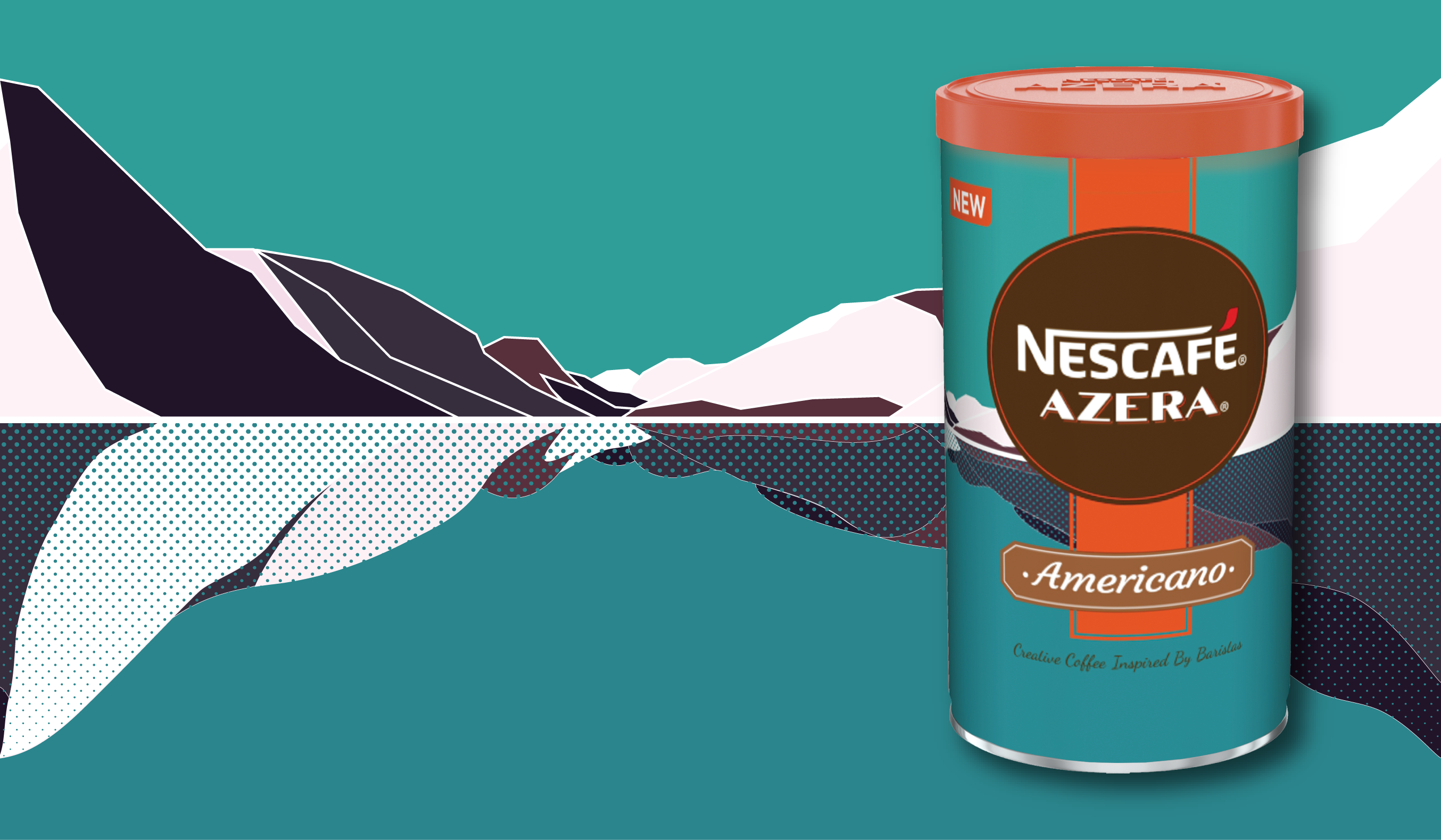
The initial illustration I made, and enetered as a second design to the competition, wasn’t the winning one. I went on a completely different topic, as I happened to spend a lot of time by the water at that time, and thinking the connection to the water for each and every town in Norway I have lived in or visited, In many towns there isn’t even so much “urbanity”, the natural landscape dominates the man made, and as such flavours each and every abandoment of the four walls. I also see Azera coffe as something that would be easy to take on a camping trip, tin being quite small and coffee being quite instant, and wanted to connect to this feeling of vast landscape.
So I started working on the landscape design, fitting the color pallette to the orange and brown of the Azera package, and liked the dominant blue color that contrasted and complemented the Azera colors good.

First entry named "Vastness"
From the description from the competition entry: Vastness as the intricate condition of the Norwegian existence, in landscape and culture - connection to the water, be it see or lake; connection to the nature and to the wild and raw side. Clean-cut, high-contrast environment, mirroring its vastness in the stillness of the omnipresent water. A popular retreat from the urban life for the target group - young city-dwellers, is camping or spending time in the vast woods surrounding all major cities in Norway. With Nescafe being an instant option for a good cup of coffee on the road - I wanted to evoke the feeling of open possibilities, freedom and adventure when picking up the Nescafe tin from the shelf.

Working on the second design
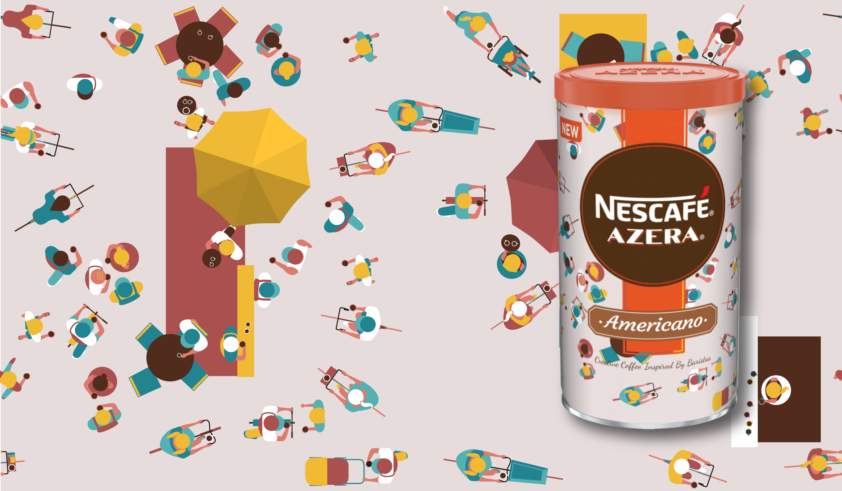
I found the theme interesting, and wanted to explote another direction. As we were in the middle of a period of really nice weather in Oslo (which is not that usual), I wanted to depict how the city looks like when it’s buzzing with people, and the streets and squares are full, and everybody is out in the city. I played with a the top-down view, with people being the substance and the color of the composition, while streets, squares and other city sufraces are merged into one piece of gray. I started to play with the elements of the Azera branding, showing as if people were avoiding these, or reaching towards, getting into the elements, and interacting with the branding elements as if they were spaces in the city.

The second and winning entry named “Buzzing”
From the description of the design, source of inspiration: “People and the urban environment. Pulsating around the squares and train stations. A river flowing from all directions. On foot. Cycling. On their own. In a crowd. Swarming. In all shapes and colors. People and their movement direction subtly point towards the Azera logo focusing attention to the brand. At the same time people use the design elements of the tin as they would use the boundaries of the public spaces - they lean on the “walls”, linger around the corners, and seek leeward form the crowd. Buzzing is about people and their actions stirring up the space. People mixing up the city’s gray.”
One of the competition judges wrote: “People illustrated from a completely different angle, observed from the exact top of view help creating city wild atmosphere on a weekend morning when people have enough free time to roam and sit around, have coffee. It is a beautiful moment that has been captured in this design.” Pavel Fuksa, jury member.Read more about the competition and check out all the winning designs at http://www.czechdesign.cz